
The Perfect Fall Colors for Your Outdoor Family Photos
How to Work With and Not Against Autumn Hues
Fall golden hour sessions are definitely my most sought-after time slots for family pictures. In the Midwest, autumn is an incredibly beautiful season. Mother Nature paints swaths of red, orange, and yellow accents across the landscape, and clients want to adorn their walls with her artistry.
But with nature already using such a bold color palette, it can be hard to pick a wardrobe that complements the tones present in the landscape. Clients always want to know what colors to wear for fall family photos.
Use Nature to Guide Your Outfit Inspiration
We can talk about color theory later (and we will), but for right now, we'll start simple.
Let the environment do the work for you. Mother Nature has already done a fabulous job of selecting fall colors so let’s just capitalize on her skillset.
Take a look at this stock photo of a beautiful fall landscape. Pretty, right. Colors, colors, everywhere. You can see a range of hues from the blue of the sky to the deep brown of dying leaves.
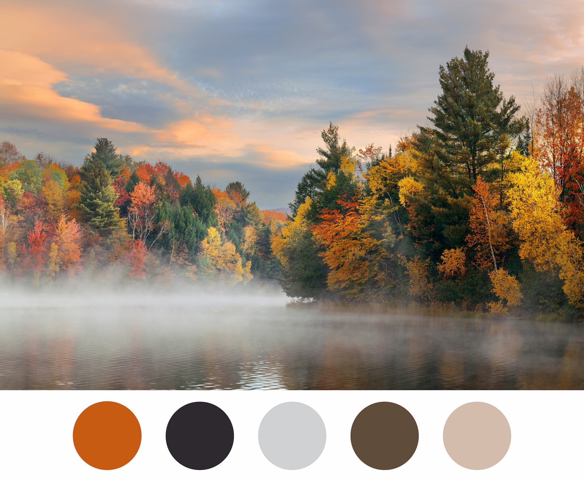
Now, pull two colors from the image. Any two will work, but it's always best if actually you like them. These will be your starter colors.
Next, add two to three neutral colors to the color combination. [Neutral colors include hues like ivory, bungalow brown, dusty sand, heather gray, pale wheat and pale orchid. For more inspiration, check out this extensive list.] Tada. You've just created a color palette that you can use for fall family pictures.
Here's an example that I created using the image above. I pulled two of my favorite autumn hues from the foliage: marigold and dark plum. I then paired them with gray, beige, and brown. Ah, so pretty and perfect for fall.
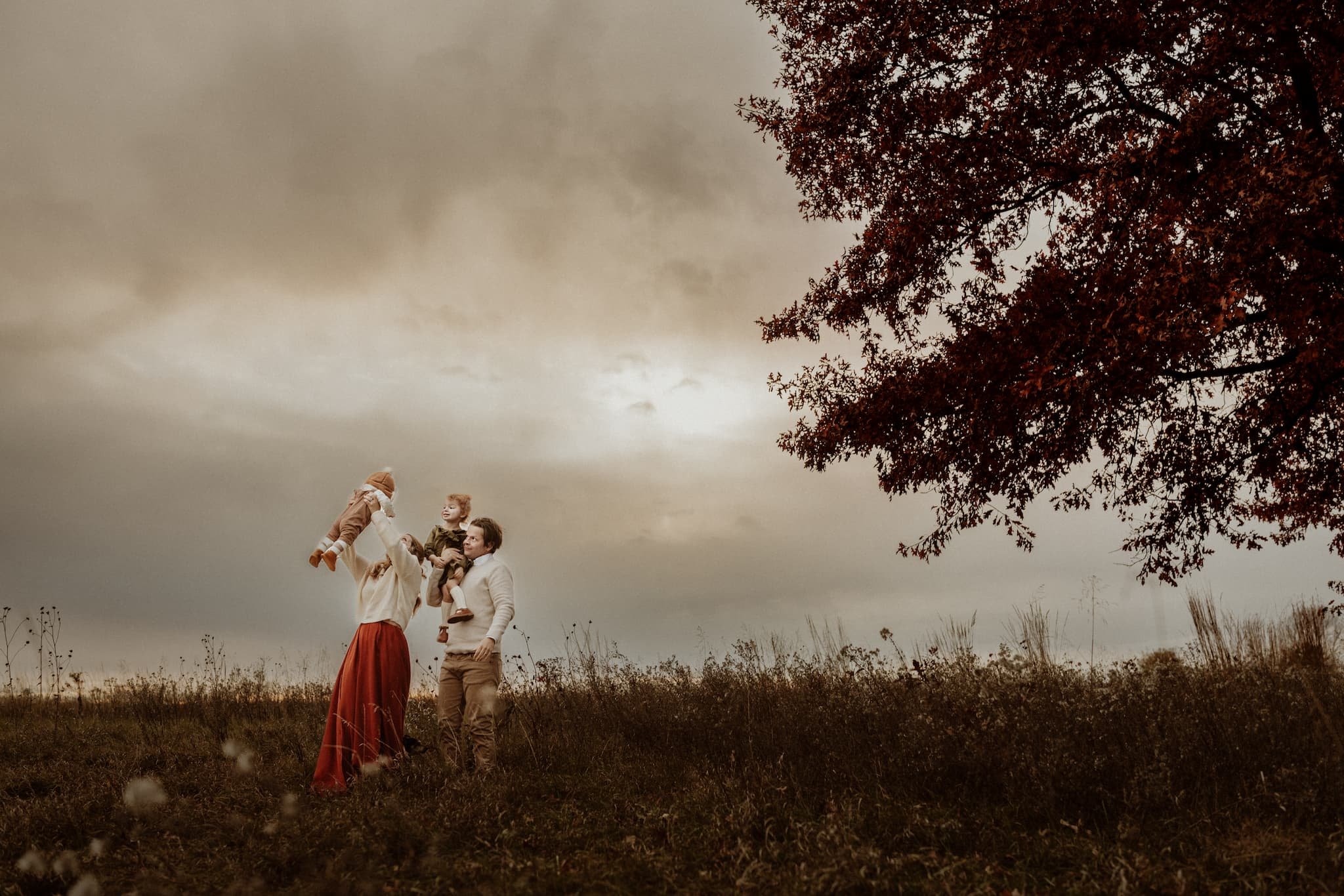
I used a similar color palette for this family portrait last year.
The Grassy Meadow
Let's try again, but this time, we're going to play with another beloved location for fall photos -- the ever-popular field of grass -- and pull some more wardrobe colors that will look amazing in that setting as well.
This time, I selected four colors from the image and added a few additional neutrals.

Work With Your Location & Select Outfit Ideas
Now that you've had a bit of practice, it's time to create a palette using the location you chose for your fall family photos.
Build up your wardrobe using the new color scheme that you've created. Consider your entire family, and don't style everyone in the same color. Instead, pull from the single color palette to ensure that your family photos are coordinated.
I know it sounds like a lot of extra work, but trust me, it makes a huge difference in the end result.
Start with mom. If your family doesn't include a matriarch, start with oldest daughter. I typically start with females because their clothing has a large range in both color and patterns. If the females in your family like dresses, the easiest option is to select one in a solid color from your color palette. But definitely don't dismiss a floral or a pattern. I prefer dresses that are comfortable and will incorporate movement. If mom doesn’t love a dress, consider a shirt and skirt, or jeans and a kimono.
Now that you've styled a central figure in your family, you can fold in hues from the rest of your color scheme. I like using the color from mom's outfit as an accent color in some of the other outfits.
Use neutral colors liberally. (You can style your whole wardrobe in just neutrals if you'd prefer a more muted palette.)
Add layers and textures to increase the visual interest of your fall family photo outfits.
If mom (or dad) will be holding a baby or toddler for a good portion of the photo session, try not to dress them in the same hues.
Incorporate shades and tints from your color palette. [More about that below.]
Round and Round the Color Wheel
We're gonna go back. Like waaaay back. To grade school. When our understanding of color came from crayons and mixed paint. As kids, our teachers showed us a color wheel and taught us that there are three primary colors: red, yellow, and blue. Halfway between each pair of primary colors is a secondary color: red + blue = purple, red + yellow = orange, and blue + yellow = green. Basic, right?

This pattern continues and creates even more hues: the tertiary colors. But this time we're combining a primary color with its neighboring secondary color, and we're creating colors like violet, teal, and magenta.
This elementary understanding of color is the bedrock on which we can create stylish color schemes.
Complementary Schemes
Hues positioned directly across from each other on the color wheel are called complementary colors, meaning out of all the colors, their hues work best with each other. It's basically opposites attract: red/green, blue/orange, yellow/purple. When using complementary colors in your fall family photos, you don't want to use bright blue and bright orange, for example. Stick to colors found in nature and then use their complementary colors.
Analogous Schemes
Analogous color palettes occur when you use two or three continuous hues on the color wheel. For example, if you combine yellow, amber, and orange into the same outfit, you've styled it with analogous colors. People who have low contrast between their skin, hair, and eyes (think a pale blonde with light blue eyes) can easily pull off this palette.
Triadic Schemes
Triadic color schemes are combinations of colors that are equal distance from each other on the color wheel: amber, magenta, and teal; orange, purple, and green; red, yellow, and blue; and vermillion, violet, and chartreuse. These colors balance each other and create a harmonious look.
Tints and Shades (And How to Use Them)
We've learned about the color wheel and color schemes, but now we need to discuss the three measurements of color that are key to effective color matching:
Hue (the actual color)
Saturation (intensity of color)
Brightness (the amount of white or black mixed in with the color, aka tint/shade)
Let's use our fall friend marigold (the hue) as an example. If you add black, marigold + black = a burnt orange. By adding the black, you've darkened the marigold, thereby created the shade burnt orange. However, if you add, white, marigold + white = peach. By adding the white, you increased the brightness, and created the tint peach.
By adding black or white, you can develop shades and tints of the various hues, and you can create a really strong look using this concept.
What Not to Wear
In fall, there is a ton of room for color variation and experimentation. But please don't wear neon. Anything neon in autumn just seems like it would be a disaster.
Liz Davenport of Sunshine and Shadows Photography is a high school senior and family photographer based in Kansas City, MO. She offers portrait sessions throughout the Kansas City-metro, including Leawood, Overland Park, Shawnee, Lenexa, Mission, Belton, and Raymore. Her sessions are fun and relaxed, using primarily natural light and a lot of movement. She loves to work in both rural and urban environments and definitely looks to her clients for location inspiration, which means that she wants to hear your crazy ideas.