
How to Style Your Family Photos on a Gallery Wall

Four Beautiful Ways to Tell Your Story
You did the hard part: you booked the session, picked the outfits, wrangled the kids (and maybe the dog), and together, we created images that captured your family's joy, tenderness, and chaos. And now the digital gallery is glowing on your screen, making your heart skip whenever you open it.
But here's the thing—those photos weren't meant to live behind a password. They were made to be seen, touched, and walked past daily. They were made to tell your story in the space where life actually happens: your home.
One of my favorite ways to honor those memories is with a gallery wall. When done well, a gallery wall doesn't just decorate—it invites reflection, sparks conversation, and reminds us of what matters most. It's not about perfection; it's about connection.
Here are four of my favorite ways to style family photos on a gallery wall, from classic to eclectic, each one designed to bring warmth and meaning to your space.
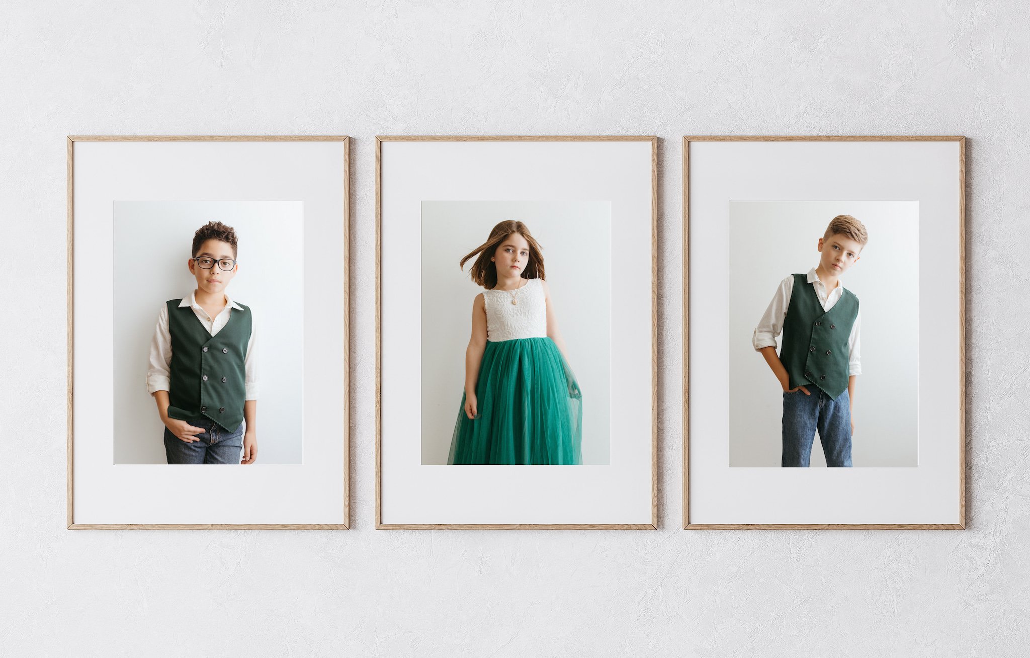
The Grid: Clean Lines, Timeless Feel
If you're drawn to balance, order, and a polished look, a symmetrical grid might be the gallery wall for you. The grid style gallery wall layout features frames of the same size and orientation—often square or vertical—arranged with equal spacing between them. Think of it as the visual equivalent of deep, calming breaths.
Why it works as home decor:
The grid layout creates instant harmony. It allows the images themselves to shine because there's no visual clutter competing for attention. This style is ideal if your home leans more minimalist or modern, or if you're working with a smaller space like a hallway or staircase.
How to pull off the photo wall:
Choose six to nine of your favorite photos (or more, depending on the size of your wall space) with a cohesive color palette. This could mean keeping all the family photos in warm tones, black and white, or using similar lighting.
Stick with matching frames and mats. Thin black, white, or wood frames work beautifully, depending on your home's style.
Use painter's tape or kraft paper to map it out before you hang it. The key to this look is precision—equal spacing is everything.
Include a mix of close-ups and wide shots for variety within the symmetry.
Tip from a storytelling photographer: Choose images that highlight different relationships—siblings laughing, a parent's hand in a child's, a quiet portrait—so the layout tells a fuller story of your family, even within a structured format.

The Organic Cluster: Laid-Back, Full of Personality
The organic cluster layout feels more like a conversation than a composition. It's relaxed, playful, and a bit imperfect—and that's exactly why it works. This style mimics how our memories feel: layered, overlapping, and full of life.
Why it works as a family photo wall:
This is the most flexible way to display your family photos. It gives you room to play with frame style, size, shape, and even texture, creating a dynamic wall that feels collected over time rather than curated in one afternoon.
How to pull off the photo wall:
Start with one anchor photo—something large and emotionally rich, like a wide family shot—and build out from there.
Mix and match frame color, size, orientation, and even frame style. The trick is to find a few unifying elements: maybe all the images are in black and white, or you use a consistent border or mat.
Embrace negative space. Don't feel like you have to cover every inch of the wall.
To give the wall even more personality, add a few non-photo elements: a small print of your child's handwriting, an art piece, a pressed flower, or a favorite quote.
Tip from a storytelling photographer: Use this layout to showcase images that feel a little more raw—movement, blur, laughter, and even tears. Let the wall be a window into the rhythm of your family's real life. If the photos are all from one photoshoot, display a pressed flower of the location or a rock your kiddo picked up.

The Statement Row: Bold, Simple, Modern
Sometimes, less is more. A single row of large prints across a hallway or behind a sofa in a living room makes a bold statement without feeling overwhelming. This elegant and grounded style gives each photo room to breathe.
Why it works as wall art:
Limiting the number of frames draws more attention to the ones you choose. This is especially impactful if your home has high ceilings or long, narrow walls that can be visually lost.
How to pull off the photo wall:
Select three to five horizontal images that complement each other in tone and composition.
Print each photo large—think 16x20 or 20x30 with generous mats—to create an art gallery feel.
Keep the frames clean and minimal. Matching frames in natural wood or metal can help elevate the presentation.
Align the center of each frame at eye level for consistency.
Tip from a storytelling photographer: This is a great place to showcase images that feel like short poems—quiet moments, soft gestures, and long shadows. The layout's simplicity lets the photos' emotions take center stage.
The Storyline: A Journey in Photos
This layout is for memory keepers—the ones who cherish the narrative as much as the images themselves. The storyline layout arranges your photos in a linear or winding path, guiding the viewer from one moment to the next, like flipping through a visual journal.
Why it works as a gallery wall layout:
It invites people to linger. Whether the photo frames follow a timeline (baby to toddler to teen) or tell a story from a single day (a picnic, a hike, a rainy afternoon at home), the flow draws the eye and the heart along with it.
How to pull off the photo wall:
Map out a directional path—a diagonal across a staircase wall, a gentle curve above a bed, or a sweeping line down a hallway.
Choose a mix of candid and portrait shots to create rhythm.
Include small captions or date plaques if you'd like additional information for your display.
Inspired? A bit overwhelmed, perhaps? Let's simplify it and start with the photos. You can reach out here to book your session or follow along on Instagram and Pinterest for ideas, inspiration, and a peek into the stories I've been lucky enough to tell lately.
And if you're stuck on which layout might work best for your space, I'm happy to help! Whether it's choosing between black-and-white and color, figuring out the right frame sizes, or designing a custom wall for that tricky stairwell, I offer wall design consultations for current and past clients. Together, we'll make something beautiful—and meaningful—for your home.