A Wes Anderson-inspired Family Photoshoot
Incorporate Color, Symmetry, and Visual Storytelling
When my client approached me last summer with the idea of a Wes Anderson-inspired family photoshoot, I was immediately intrigued. It felt like the perfect opportunity to try something outside my usual style. As a photographer, taking on new challenges is one of the most exciting aspects of the job, and this idea was an exciting departure from the norm.
That said, I had my doubts. Wes Anderson is known for his distinct, highly stylized approach to filmmaking, and it's a far cry from how I usually edit and compose my images. While I know his work and appreciate his artistic vision, his style is so specific that I found it intimidating. And, of course, he's widely regarded as a cinematic genius—no pressure, right?
Still, I was up for the challenge. I started by developing a color palette and collaborating with my client to brainstorm props that could help bring the Wes Anderson vibe to life. The fun was in the details—bright, symmetrical compositions, quirky accessories, and a soft, nostalgic color story that would evoke the same sense of whimsy in his films.








Understanding Wes Anderson's Style
For those unfamiliar with Wes Anderson's work, his films are like stepping into a storybook where every frame feels meticulously curated. Anderson has created a visual and narrative style unmistakably his own, and it's no surprise that it's influenced not just the world of cinema but also photography, fashion, and design.
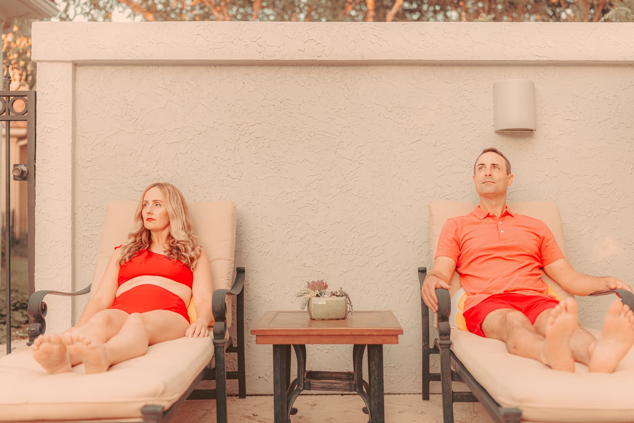
Wes Anderson's style is iconic because his use of symmetry is unparalleled. Nearly every frame in his films feels perfectly balanced, almost like you could draw a line down the center, and the two halves would mirror each other. This symmetry gives his work a structured, practically artificial look, but that's part of its charm. It makes everything feel precise, intentional, and slightly surreal as if you're peering into a world that's been carefully constructed just for you.
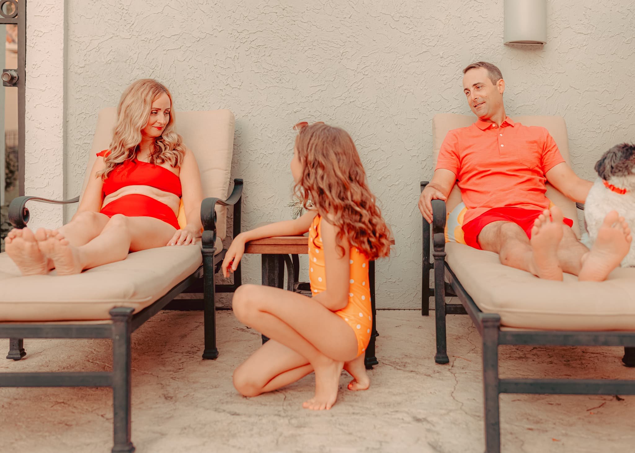
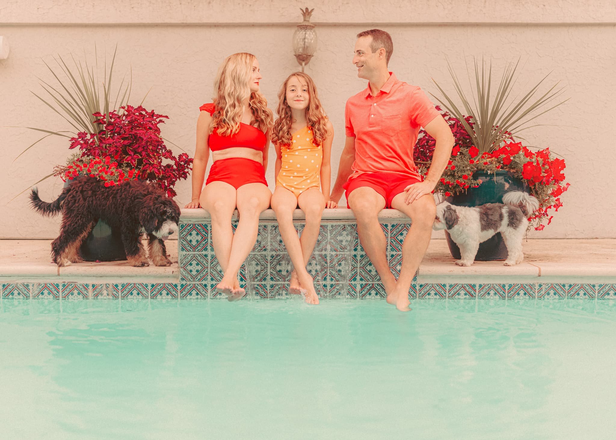
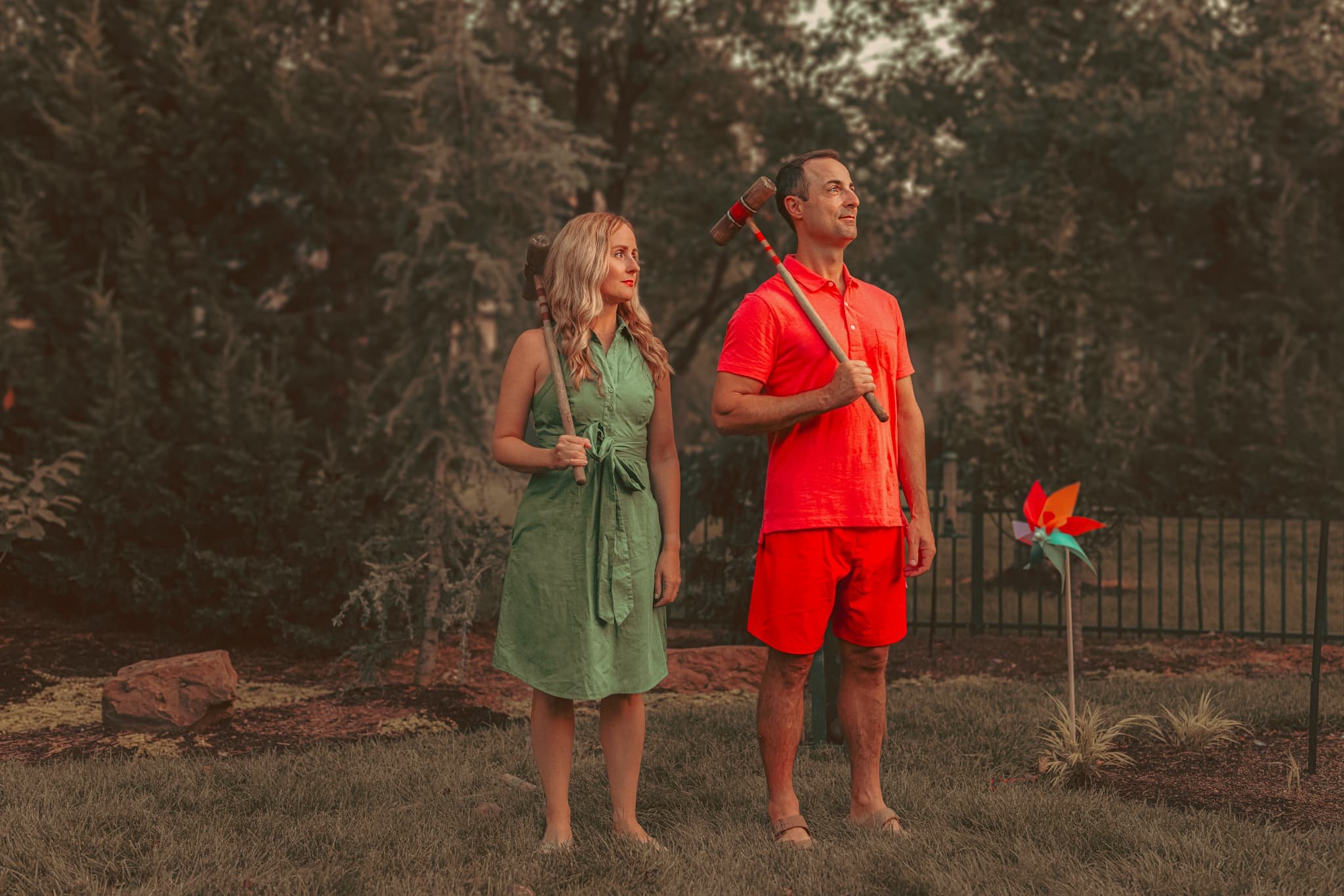
You'll notice that the family is posed very symmetrically in much of the imagery from this photo session.
Color also plays a massive role in his storytelling. Anderson frequently uses soft, pastel tones or vibrant pops of color to create mood and emotion.
In the family photo shoot, we tried to mimic this with bright pops of red and yellow.
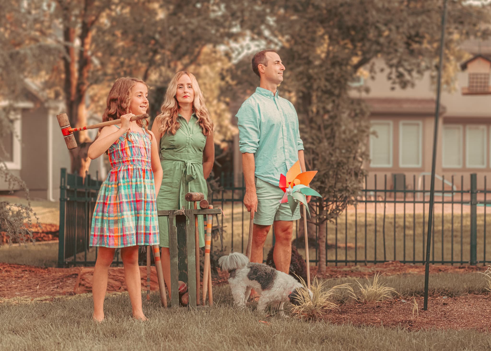
Beyond color and symmetry, props and costumes are vital to Wes Anderson's visual storytelling. From quirky accessories to eccentric set designs, every item in an Anderson film serves a purpose. They help deepen the narrative, reflect the characters' inner workings, and add a touch of whimsy that viewers have come to expect.
Nostalgia is another element that permeates his films, and it's a big part of why audiences love him. Watching a Wes Anderson movie feels like flipping through an old photo album. The warm color tones, vintage costumes, and slightly weathered props all transport you back to a different time—whether real or imagined. There's a sense of longing in his work that resonates with people, reminding us of simpler times while acknowledging that things are never as perfect as they seem.
Despite the highly stylized nature of his films, Anderson's work feels deeply personal. His characters are flawed and awkward, often dealing with relatable emotions like loneliness, loss, or the struggle to find their place in the world.
Another aspect of Anderson's brilliance is his attention to detail. Whether it's the intricacy of the set design or the specific gestures of his actors, nothing is accidental. Each prop, costume, and even character placement in the frame is intentional, all working together to enhance the storytelling. This meticulousness has earned him a devoted following of fans, many of whom obsess over the hidden details in each frame of his films.
Anderson's signature visual style and emotional depth have cemented his reputation as one of our time's most unique and influential filmmakers. While some filmmakers strive for realism, Anderson has carved out his fantastical world, inviting us to step inside and experience a visually arresting and emotionally complex narrative.
Bringing Wes Anderson to a Family Photoshoot
So, how do you translate a style as iconic as Wes Anderson's into a family photoshoot? The key is to focus on the elements that make his work memorable: color, symmetry, and story.
We began by choosing outfits that reflected a cohesive color palette—soft yellows, dusty blues, and reds. These colors created a visual harmony that felt distinctly "Andersonian."
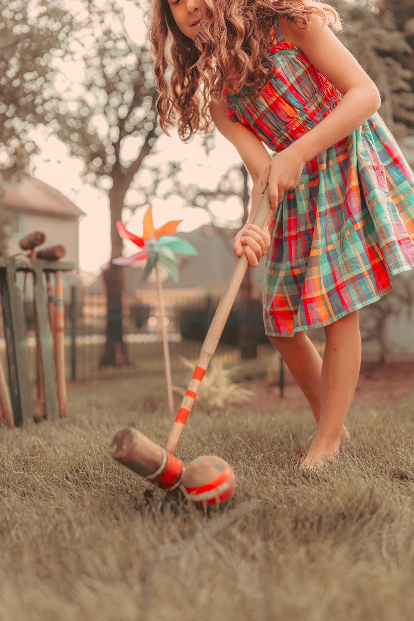
Next, we discussed props that would add to the whimsy and quirkiness of the shoot. We settled on watermelon, yellow rafts, and a thrifted vintage croquet set, giving the photos a quirky, nostalgic feel.
In terms of composition, I played with symmetry. Anderson's films are known for perfectly centered shots, so I kept this in mind while framing the photos. Every shot had balance, whether it was the family standing in a row eating watermelon or posing at the edge of the pool.
This family wanted their shoot to reflect their love for Wes Anderson's style and their love for each other and their pet dogs, which added a playful touch to the shoot.
By blending Wes Anderson's visual language with the family's unique story, we created a set of photos that felt both whimsical and deeply personal.
In the end, it was a fantastic reminder that while Anderson's style might be intimidating at first glance, he can tell meaningful stories that truly make him an inspiration. And that's something I'll always strive to do in my work—create beautiful images that tell a story.
